Bringing Consistency to Quibim
💡 Quibim is a set of Healthcare products using AI for tumor detection
Context
Quibim products grew organically during 10 years, feature by feature, and my role as the first in-house designer was to add consistency, and clarity to the users' experience.
I chose Quibim's main product, a patients' data base, to be the center of the design conversations tobring more structure and consistency to all Quibim products.
Coincidentally a new Product Manager joined the team, and she was eager to have the big picture of how database was used and where it could be improved.
👉 Creating consistency across products took place while designing new functionalities.
Step 1: Customer Journey
After my first month I realized our conversations were lacking a big picture perspective, making sure the new features I was designing were fitting the whole Quibim ecosystem.
I led a Customer Journey workshop with people from different departments: Product, AI, Engineering, Sales, to get Quibim's larger context.
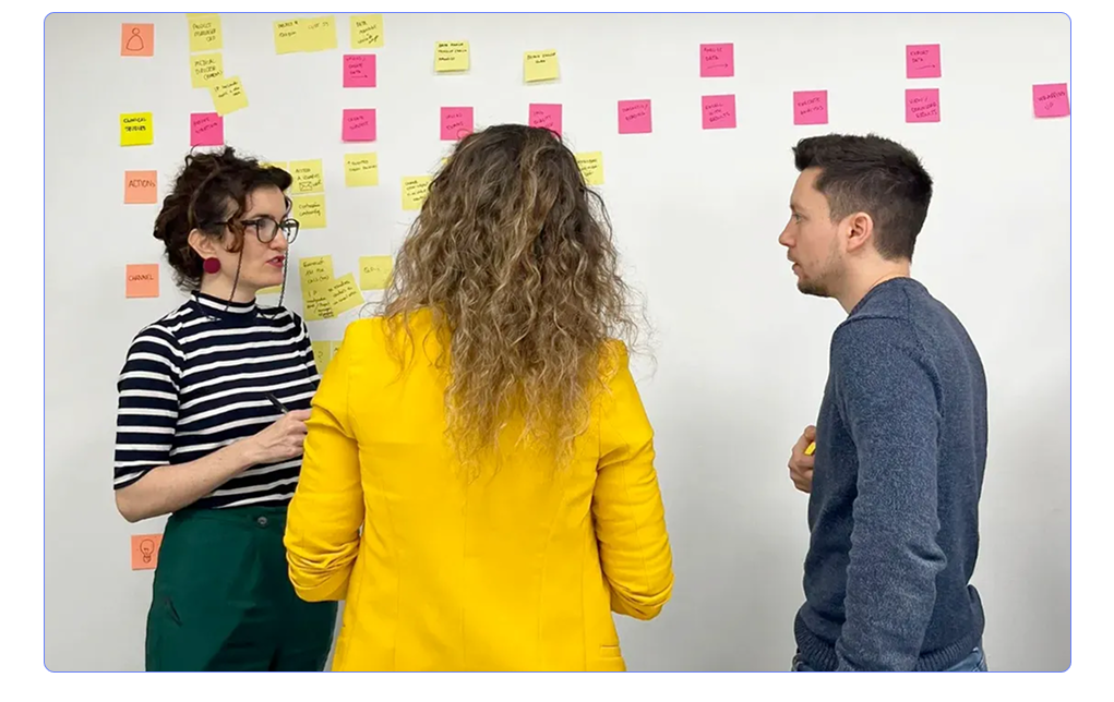
I translated what engineers, project managers, medical technitian, product manager, and VP of AI were communicating during the workshop into product insights, and a readable digital version of it, so anyone at the company could check it out.
To the list of tasks and pain points, when digitalizing the Customer Journey I added the list of key learnings, possible solutions, and when it was possible, I linked them to milestones in our roadmap.
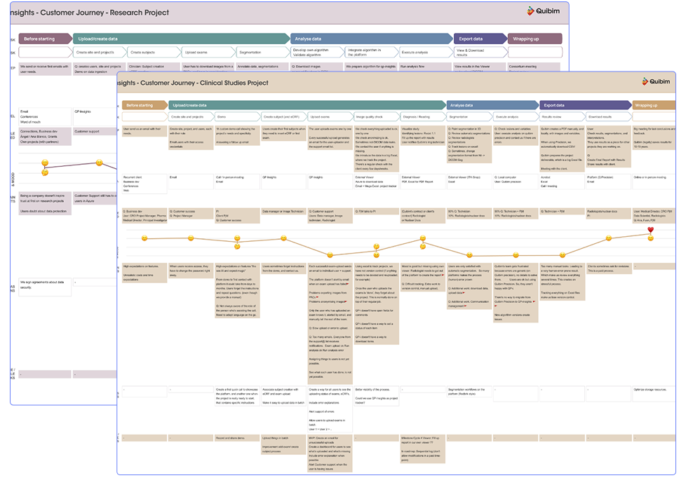
I then transformed product insights into the most actionable next steps:
👉 Our biggest technical pains in our users process inside the app were identified and already on the roadmap.
👉 It’s very common to have a different person doing each task on the platform, but there’s no visibility on the next step needed to be done.
👉 Our users didn’t have a place to check their project progress inside of the platform, we relied on their internal good communication to follow said progress.
Step 2: Actionable plans
The customer journey sparkled a new communication plan during projects, the creation of a single source of truth inside the main platform, and a more representative way of structuring our menu.
New Communication Strategy
The workshop highlighted how different people from different departments at Quibim needed a certain type of information at a certain point in a new project.
Based on our learnings, we bettered our communication, and included the most relevant people in our product meetings.
New Dashboard
Our users needed a single source of truth, a Dashboard to check how their project was progressing, and we had all the data to populate it.
Building it up wasn’t a huge effort (we already had the data) and would better our users experience.
The dashboard included all the data our users needed:
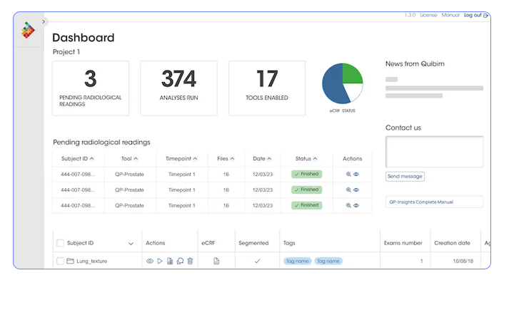
- How many patients have been created
- How many studies have been uploaded in a particular project
- How many algorithms are in use,
- What was the latest analysis run
- A direct link to their open queries
New Menu
The customer journey highlighted our platform didn't map the product hierarchy. Our users could have a better understanding of the app if we updating our menu to reflect how its organized.
Researchers, doctors, and project managers using the patients data base usually did one task each. That means changing from one part of the app to another was secondary for them. We didn't really need an always-visible menu taking up valuable vertical space.
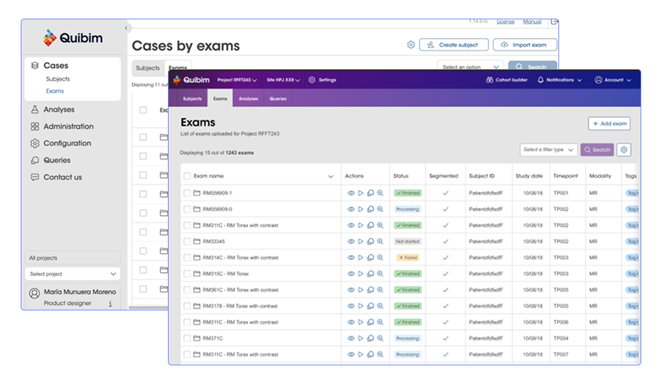
Doctors and clinical researchers are special kind of users. For them, more is more. They are used to have a lot of information in front of them and they benefit from it. Eliminating the left menu and adding that extra space for raw data was their preferred path.
👉 The menu now map the app hierarchy
👉 It's a top menu, so the user can choose to scroll and hide it and focus on the main content.
👉 Its UI is updated, and it follows the look and feel of the rest of the products
Step 3: Consistency Between Products
Unifying our users experience throught our products meant addressing multiple aspects of the product. This work was done while creating new features that could easily adapt to the changes required for product consistency.
New Medical Reports
Medical reports redesign was a project in itself.
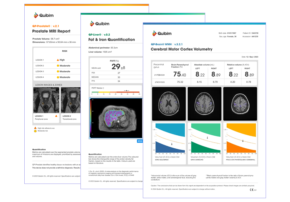
Medical Results Reports were previously showing all the information needed by doctors to read the algorithm results, but with no hierarchy or particular order. For their redesign I took into consideration:
Reports readability for doctors, and patients.
New reports needed to be ready for printing, considering printers at hospitals are usually set for black and white.
They would follow Quibim's branding, and feel part of Quibim family of products.
And they would have their information organized by importance. What do doctors first check out in lesions in this particular organ?
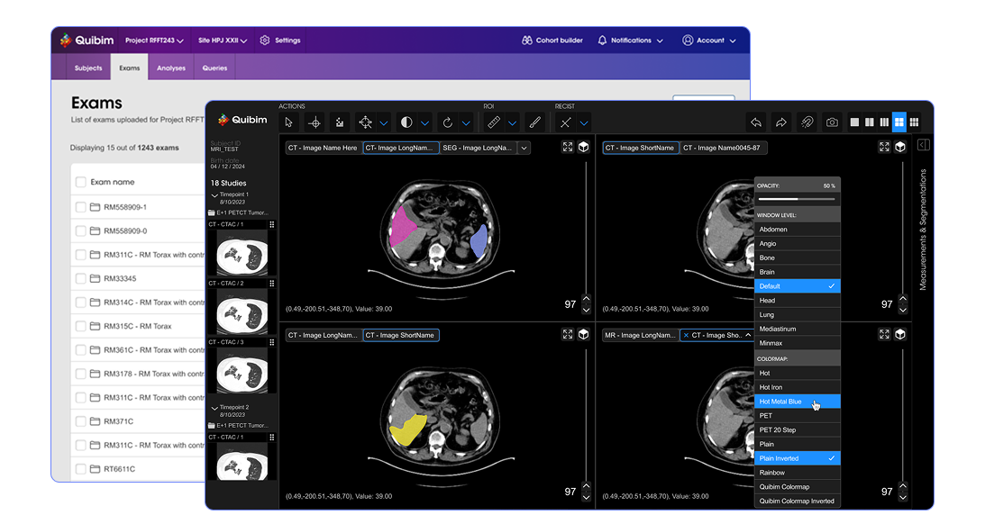
Medical Images Viewer Update
I designed Quibim’s Medical Images Viewer using the same components as the database platform only changing its colours.
I designed Quibim's Medical Viewer in dark mode because radiologists and technitians normally check medical images in dark rooms. While shadowing real users, they would turn off the lights when analysing on images.
I designed how to segment organs, how to measure lesions, and how to apply filters and navigate between medical images, following strict Healthcare regulations, while keeping consistency and clarity.
Including AI as part of the user workflow was the most complex functionality because it didn't exist before. For more information about the design of the Medical Viewer, please contact me at mariamunueram@gmail.com